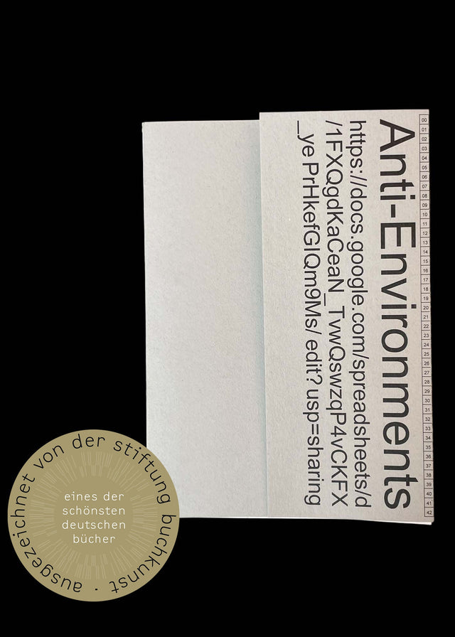
Up and Coming: Sponsorship Prize for Young Book Design 2026
Lena Ludwig
Yitong Feng
Celia Joy Homann
July 2 - August 1, 2026
Vernissage⎢Thu. July 2, 18 - 21 hr
Wed. Thu. Fri. 11 – 18 hr / Sat. 11 – 16 hr
einBuch.haus / Lindenstr. 91, 10969 Berlin
In cooperation with Stiftung Buchkunst

To mark the presentation of the »Sponsorship Prize for Young Book Design«, this year’s prize winners are being honoured with an exhibition. The three award-winning works by Lena Ludwig, Yitong Feng and Celia Joy Homann each engage with language in their own way – as an individual expression, as a new reality of life and as a tool for verbalising pain. This is reflected in the design of each book project: in the choice of materials, the juxtaposition of illustration styles, or the reference to the aesthetics of a crossword puzzle combined with a Duden dictionary. On display are a photographic work alongside a sculptural interpretation, illustrated banners serving as a semi-transparent translation of the narrative into space, and a postcard installation combined with scarves that continue to develop the theme. The exhibition is further complemented by other book design entries from the shortlist for this year’s sponsorship award.

Lena Ludwig
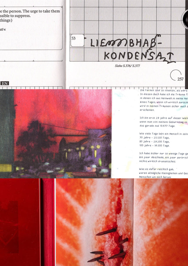
Liebhabkondensat
Eine Sammlung von 100 familiären Idiolekten
Yitong Feng
HEIM-WEG-FREMD-WEG
Celia Joy Homann
Vulvodynie
Schmerz der Weiblichkeit

Lena Ludwig, Liebhabkondensat: Eine Sammlung von 100 familiären Idiolekten
If we speak a shared language, we speak the same language. Or do we? In fact, if you were to document the words we most commonly use, you’d find our language – shaped by our home region and sense of humour – varies more than you might think. This individual way a person uses words – made up of their vocabulary, linguistic patterns, phraseology and pronunciation – is known as an idiolect.
Here, the author presents her own idiolectic lexicon, albeit one defined more by emotional connections than rational considerations. That goes both for its dictionary-like lexical entries and its graphic design. Liebhabkondensat explores 100 informally coined words, providing explanations in English and German. The project also first invites readers to engage playfully with these words via personal interpretations.
As with crossword puzzles, which this book’s design language references and gives a contemporary twist, meaning results not just from specific definitions but also via references, lacuna and connections. For the author, the personal takes on what a word might mean are not so much misinterpretations as suggested new meanings. The reader themselves can use either clusters of images or written clues to guess the meanings of each term. Alternatively, they can go straight to the correct meaning using the cross-references.
This compact personal lexicon is a handily sized volume that offers various ways to engage with its entries. It has a fresh look that’s due in particular to the striking headline font and the graphic design’s distinctive grid, while the book block features indentations in the form of rounded cut-outs that allow the reader to jump directly to different chapters. With its well thought-out design, the book is a pleasure to use and may well inspire readers to document their own individual idiolect.
Lena Ludwig (*2003, Hanau) lives and works in Aachen. She is studying Communication Design at Aachen University of Applied Sciences, specialising in editorial design, typography and photography. Her work straddles the fields of design, art and communication, with a particular interest in the connections between different disciplines and levels of perception. Alongside her creative practice, she has gained experience in the fields of design, editorial work and communication management. Her work is characterised by a keen eye for detail, atmosphere and interpersonal encounters. She explores how design can create spaces – for exchange, attention and new perspectives on everyday life.

Yitong Feng, HEIM-WEG-FREMD-WEG
Oscillating between her Chinese hometown of Xi’an and Berlin, the city where she chose to work and study, Yitong Feng’s autobiographical graphic novel shows us what it’s like to arrive in a foreign country and feel out of place.
Specific moods, street scenes and intimate interiors – be it her bedroom ceiling after a vivid dream of home, a produce market, a German cheese counter, a tofu stand in Xi’an or flowers captured as photographic greetings for loved ones in China – are strikingly captured in bold and atmospherically dense full-page illustrations that come accompanied by brief comments in English and Chinese. They are juxtaposed with diary-style pages featuring monotone blue line drawings that caricature the individual anecdotes, concerns and challenges. The German language adds a further ingredient, one that plays an increasing role as the book progresses: at first, there is just illustrated vocabulary, then a bewildering swirl of “der, die, das” articles, but by the end the author is expressing herself in German as well as in Chinese and English.
The waxy style of the chalk drawings is emphasised by the choice of paper, with areas featuring lots of solid colour looking glossier, while sections with line drawings have a more matt feel. A small risograph booklet inserted in the centre of the book provides another emotional narrative layer. The book’s fragmentary narratives are organised into eight chapters in which new and intriguing visual elements regularly emerge, be it an illustration of a smartphone chat or the scanned edge of a torn-off jotter page.
Even the front and back cover visualise the sense of being pulled between two worlds – worlds that, as shown by the illustration running across the spine, are both connected and separated by a plane journey. For the reader, it all adds up to a multilayered and personal story that is vividly brought to life.
Yitong Feng (*1996 in Xi’an, China) lives and works as an illustrator in Berlin. She studied Visual Communication, specialising in graphic design, at the Xi’an Academy of Arts, and subsequently studied illustration at the UDK Berlin, where she completed her Master’s degree in Visual Communication with distinction. In her artistic practice, she combines illustration, graphic design and visual storytelling. Her work ranges from personal observation to social issues and poetic visual worlds. She is particularly interested in the ability of images to convey cultural experiences and to open up new approaches to complex topics. Her work has already been exhibited in Germany, China and Poland. In 2026, she will be part of the Berlin Comic Scholarship exhibition at the Museum für Kommunikation in Berlin. Alongside her artistic work, she curates and develops exhibition projects in an international context.

Celia Joy Homann, Vulvodynie: Schmerz der Weiblichkeit
This cover is no soft touch – the majority of the front board is overlaid with sandpaper. Beneath it is a gloss-red film, glimpses of which we can see through the book title lettering and abstract labia design that have been laser-cut into the sandpaper.
The book itself is an attempt to give visible and tangible form to vulvodynia, a chronic pain syndrome that often goes unseen and undiagnosed. Together with various sufferers, the author devised a unique visual language that enables readers to access this especially intimate and shame-inducing subject.
On opening up the reddish book block, it’s immediately apparent that the content is split into two narrative sections. Each is covered with a semi-transparent gloss-red film that means you can’t make out what lies beneath.
The left-hand half presents the perspectives of individual sufferers, telling their stories with the aid of interview questions – their diagnoses, their sense of being misunderstood and their personal strategies for coping with the pain. Red lettering, red gradation in the gutter and blurry, slightly abstract red portraits further intensify the emotional atmosphere. This section also features a glossary, comments from physicians and therapists and details of possible treatment pathways, thus providing readers with more in-depth information on what remains a relatively unknown condition. The right-hand side, meanwhile, contains a kind of photo essay that developed over time and took its cue from the interviews. Combining different styles, the photos are accompanied by pithy quotes with particularly striking messages.
This is a brave project that, via text, visuals and materials, provides insights into an ailment that has hitherto been largely overlooked.
Celia Joy Homann (*1999, Hamburg) works as a photographer at the intersection of conceptual portrait photography, photo editing and curatorial practice. Her work explores intimacy, physicality and social constructs, as well as the question of how visual narratives translate personal experiences into collective contexts. She is studying photography (MA in Photographic Studies) in Dortmund and spent a semester abroad in Budapest during her bachelor’s degree. Her experience in picture editing at “Stern” and her current work at “GEOlino” have shaped her perspective on visual storytelling and contemporary visual culture. She now lives and works in Hamburg. Alongside her photographic practice, she is a co-founder of the event series “Runde Ecke” and is active in the “Freundeskreis der Photographie Hamburg”.
Sponsorship Prize for Young Book Design
The competition Sponsorship Prize for Young Book Design aims to detect inventive ideas on printed publications or hybrid book forms, and thus developments in the field of editorial design: An attempt to create visibility for impulses of tomorrow as well as quality concepts of today. This design competition for the up- and coming does not focus on technical perfection but on conception. Endowed by the Federal Government Commissioner for Culture and the Media, awarded since 1989.
Stiftung Buchkunst
Stiftung Buchkunst awards »The Best German Book Design« of a year, offers a platform for rethinking the medium of the book with »Sponsorship Prize for Young Book Design«, and networks international book design competitions under the umbrella of »Best Book Design from all over the World«. Stiftung Buchkunst (German foundation for book design) has been a recognised foundation under civil law since 1966. It´s founded by the German Publishers and Booksellers Association, the German National Library, the City of Frankfurt/Main and the City of Leipzig.
PRESS RELEASE
Exhibition View: Up and Coming: Sponsorship Prize for Young Book Design 2026, einBuch.haus, 2026 (Photo: Hyemi Cho)