


The Leporello Series
For The Leporello Series, ll’Editions has invited a select group of international artists to contribute. Each artist is given carte blanche, restricted only by the accordion format and its ten panels (recto). To date, participating artists include (in order of appearance) Heimo Zobernig, Micah Lexier, Fiona Banner aka The Vanity Press, Ryan Gander, Shannon Ebner, Maurizio Nannucci, Karl Holmqvist, Jonathan Monk, Peter Laurence Mol and Endre Tót.
Inhabiting a space between book and paper sculpture, the Leporellos are printed on delicate Mohawk Superfine Eggshell paper. Each volume in the series is limited to 250 numbered copies and come in a bespoke rigid box, with the title hot foiled both on its front and on its spine, allowing it to sit comfortably in a bookshelf when not on display.
The Leporello Series
ll'editions, 2021 - 2025
Leporello N° 01 by Heimo Zobernig
For the first volume in The Leporello Series, Vienna based artist Heimo Zobernig makes optimal use of the accordion format, allowing rhythmic wording and typography to seamlessly transcend from individual words and phrases to shapes and structure. Repetition plays an integral role as the borders between the conjoined pages blur.
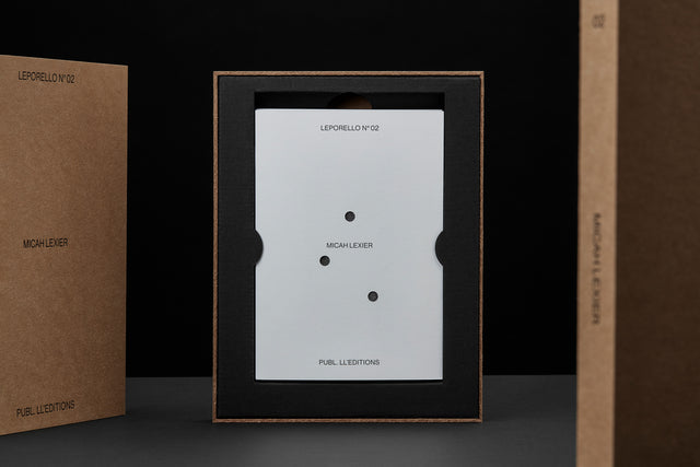
Leporello N° 02 by Micah Lexier
A number of years ago Micah Lexier purchased a small paperback publication about the game of dominoes. The very end of the book consisted of a series of pages that reproduced a complete set of twenty-eight domino tiles. The images were printed on right-hand pages, four to a page, while the left-hand pages were blank. The idea was that you were supposed to cut these images out of the book and glue them to empty matchboxes to create your own do-it-yourself set. That sequence of pages, combined with the quality of their reproductions, was the inspiration for Lexier’s leporello. To that, he added two favourite print techniques – perforations and die-cut holes – to create a set of ten domino tiles. Lexier chose the denomination of each tile and its order in the leporello so that none of the thirty-four die-cut holes line up with each other, allowing each hole to be misread as a printed white domino dot.
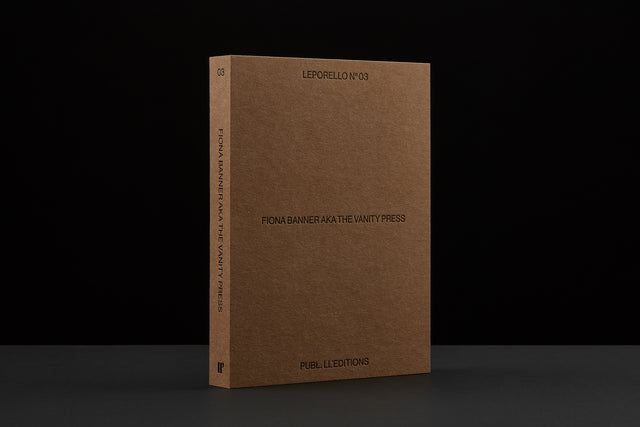
Leporello N° 03 by Fiona Banner aka The Vanity Press
Fiona Banner aka The Vanity Press does not waste words in BAD REVIEW. Both deadpan and playful, Banner’s Leporello N° 03 uses images from her work Portrait of an Alphabet, 2009; a series of images made in a photo booth, reconfigured to read Bad Review.
The sudden flash disrupts the notion of privacy behind the curtain in the narrow booth, only just large enough to fit a small chair. The artist is shielded by the large scale typographic print-outs she holds up. Only slight details; a glitch here and parts of a hand there, reveals the process behind the work.
For Banner, often incorporating language and text in her work, the work can be seen as a form of self-portrait. A portrait of the artist as a typeface.
Leporello N° 04 by Ryan Gander
The narrative is not completely linear. Or perhaps it can be? Ryan Gander’s Leporello N° 04 presents excerpts of his digital word compositions displayed as part of the 2020 work Staccato Refractions. Presented as concrete poetry, the prose reveals intentional glitches, making the reader question the nature of the narrator. Man or machine? Is the text, or parts of it, a message transmitted by a computer, or perhaps an example of distributed thinking?
The text is rendered in minuscule typography, transforming it to shape and form. For its transcription, the use of an included magnifying sheet is necessary. In the background, a pale sequence detailing the moon’s movement is rendered. Once lights are dimmed, the moons start to glow, moving from subordinate to superior.
Ryan Gander’s Leporello N° 04 is printed in both offset lithography and silk screened with glow in the dark ink. Each copy includes an acrylic magnifying lens.
Leporello N° 05 by Shannon Ebne
For Ebner’s leporello, the meteorological term RIME ICE is its single subject, though the phenomenon itself falls into two categories, soft or hard rime. In either case it is rime ice that forms when liquid droplets comprised of supercooled water freeze onto surfaces. RIME ICE is an outtake from Ebner’s recent exhibition FRET SCAPES (2022). FRET is acronym for the Forecast Reference Evapotranspiration Report, a report that is generated by climate scientists to measure the rate at which water that falls to the ground will evaporate to the sky.
Leporello N° 06 by Maurizio Nannucci
A good work of art can be approached from different angles. A great one can be read upside down. For Leporello N° 06, Maurizio Nannucci continues his explorations of language, which has become a signature of the artist, as manifested across an expansive range of media over the past six decades.
Leporello N° 07 by Karl Holmqvist
Listed leporello links linguistically lean language. For Leporello N° 07, Karl Holmqvist performs a session of Language Yoga; the artist’s highly subjective take on concrete poetry.
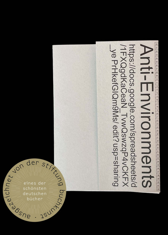
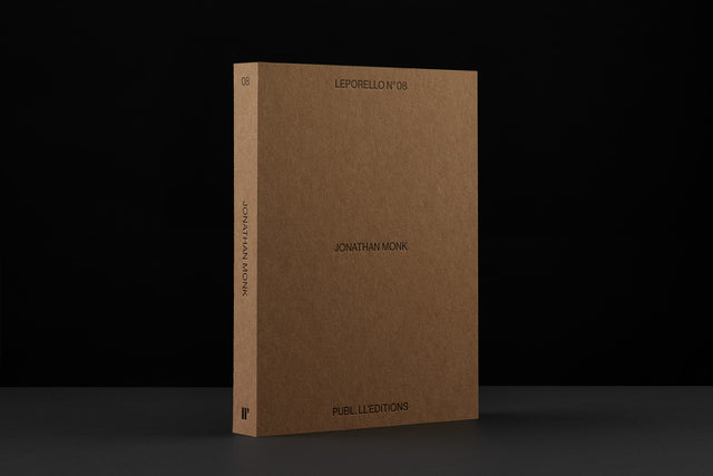
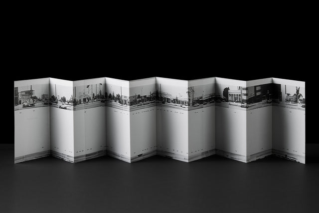
Leporello N° 08 by Jonathan Monk
Following Ryan Gander’s moon sequence in Leporello N° 04, Jonathan Monk proposes that a new day is dawning. Saving himself the cumbersome task of yet again* walking in Ed Ruscha’s footsteps along the seemingly endless Sunset strip, Monk captures the zeitgeist through more accessible means. With the camera of his iPhone 12 set to Panoramic mode, Monk photographed Ruscha’s 1966 milestone artist’s book – perhaps the most celebrated book to ever utilize the leporello format.
Leporello N° 09 by Peter Laurence Mol
In his contribution to the Leporello Series, Pieter Laurens Mol challenges the viewer with a paradox; an artist’s book demanding tactile interaction, articulating a prohibition against such engagement. Traces of the artist’s own touch are evident on the front and back of the leporello, further prompting an impulse to experience the book by allowing one’s hand to traverse the paper’s surface. The blind embossed message appeals to our inherent mischievous nature, seemingly suggesting that established norms are subject to defiance.
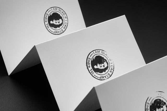
Leporello N° 12 by Endre Tót
DUB-DUP, DUB-DUP, DUB-DUP, DUB-DUP, DUB-DUP, DUB-DUP, DUB-DUP, DUB-DUP, DUB-DUP, DUB-DUP. I AM GLAD IF I CAN STAMP.
Since 1971, Hungarian artist Endre Tót has worked with a series titled ‘Joys’ — beginning as a reflection of the dictatorial conditions Eastern European socialism during 1970s. The absurdity of the naive and euphoric expressions of joy stood in stark contrast, not only to the oppressive political climate, but also to the intellectualism of the art world. In 1978, Tót wrote “I’d be happy if I could write on the other side too” on the Berlin Wall. Over the years, Tót has repurposed this phrase a number of times, in different contexts.
99 x 142 mm (folded), 990 x 142 mm(plano), Mohawk superfine eggshell ultrawhite 175g / Artists' books in rigid box
Offset print
Edition of 250