

16 June 1904
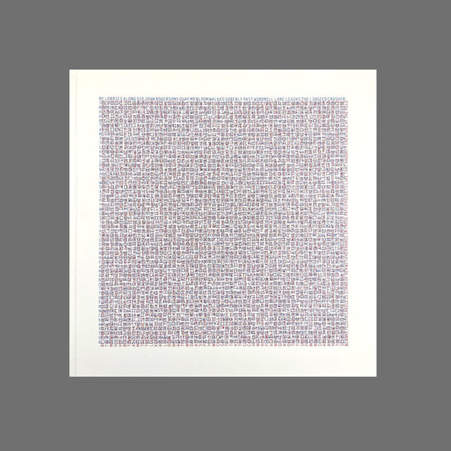
This publication is based on James Joyce’s great literary work “Ulysses”, which in turn draws from the classic epic Greek poem “Odyssey” by Homer. Few will have truly read these works, and even fewer will ‘read’ this publication.
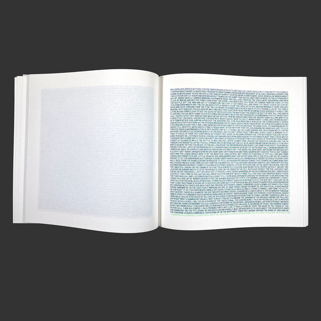
The text of “Ulysses”, via Project Gutenberg, has been stripped of all punctuation, numbers, and special characters. Only the Latin alphabet remains, in capitals and narrowly spaced. The font used is Letter Gothic bold in 12 and 24 points. The various densities of these monospace letters give a vibrant visual effect. Typography is steered into bare minimum. The 22 colours used are primarily chosen by chance.
Each chapter of the original publication as well as this graphic translation have a unique style. Thanks to James Joyce and Homer for inspiring this project.
16 June 1904
Jo Frenken, 2024
300 x 300 x 30 mm, 300 pp
Binding: Hand bound by the artist
Risoprint, screen print
Concept, design, printing, and binding by Jo Frenken
Numbered and signed edition of 50
Riso colours: black, light gray, purple, federal blue, medium blue, blue, cornflower, teal, green, fluorescent green, fluorescent yellow, yellow, fluorescent orange, orange, fluorescent pink, fluorescent red, warm red, bright red, crimson, flat gold, metallic gold, brown

Newsletter abonnieren
Informationen über Veranstaltungen, neue Künstler*innenbücher und Drucke direkt in Ihrem Posteingang.
einBuch.haus
Ein Projektraum und ein Verlag mit Sitz in Berlin, präsentiert internationale Künstler*innen und Grafiker*innen durch Ausstellungen, die das Konzept eines Buches in den dreidimensionalen Raum übertragen, und veröffentlicht diese Ausstellungen zudem in Buchform, um das Medium des Künstlerbuches hervorzuheben.
